I don’t know how many times I have been asked, “What is your favorite white paint color? Whether is it for the exterior or interior of a home, white paint differs for each application. Below is a list of top designer’s favorite white paint color and why.
10 White Paint Colors That Top Designers Swear By
With endless shades of white, here’s how to get it right.
By ELLE DECOR EDITORS
MAY 1, 2020
If the thought of choosing a paint color pains you, picking out a perfect shade of white is a nightmare come to life. Pure white? Off white? Simply white? Whether you’re painting a
home office, ceiling, or the
walls of your master bedroom, choosing the right white makes more of a difference than you’d think. To save you from the headache of trying to decide between hues that seem nearly indistinguishable, we got the scoop from top designers on the best shades of white, and where to use them
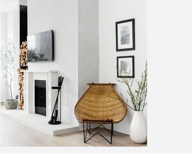
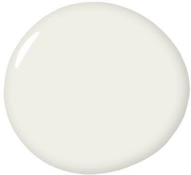
1.) CLOUD NINE, BENJAMIN MOORE
"As a colorist, white is seldom on my mind, but when I need a neutral gallery-esque background, I reach for Cloud Nine by Benjamin Moore. I painted the exterior of my office building in this particular shade and it's the perfect contrast to the gloss black trim."
2) SNOW DAY, CLARE
"Snow Day is the perfect cool white that has just enough warmth to keep it from feeling sterile. This is a great option for a south-facing room or for a bright white to pair with cool colors." -
Nicole Gibbons
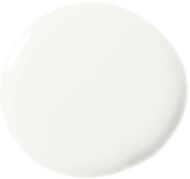
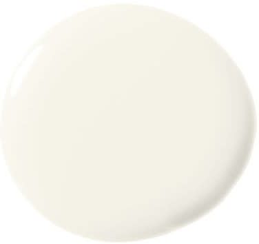
3) PURE WHITE, SHERWIN WILLIAMS
"Finding the right white is always a tricky task. However, I’ve found that a successful shade of white is one that’s honest and bears no hidden undertones of blues, yellows or pinks. Pure White by Sherwin Williams is an elegant white, which grounds the space and creates a nice neutral background to allow your furniture to shine." -
Eileen Keshishian
4) WHITE DOVE, BENJAMIN MOORE
"Our go-to living room paint color, Benjamin Moore White Dove, is a warm white that perfectly complements the fresh pastel colors of this feminine space, creating a calm and welcoming room for entertaining. We typically opt for the wow color moments in the fabrics and accessories, rather than on the walls, to keep the living room a more transitional space and the formal center of the home."
- Christine Markatos
"White Dove has a creamy undertone that brings a lovely warmth to homes in urban environments or those in climates that often experience grey and overcast skies. Meanwhile, in more traditional settings, White Dove reads as a crisp white without being
too cold or modern." -
Emilie Munroe
"I love to use White Dove by Benjamin Moore. It’s so versatile! Because I focus a lot on art and artists in my work, this color never fights with sculptures, street art or abstracts. My favorite thing to do is apply one coat of
Wise Owl's Opalescent Pearl Glaze over the White Dove. It softly shimmers with directional lighting, and the walls 'slow dance' without fighting with the art, fabrics and rugs. It's clean, simple and timeless!" -
Kari Whitman
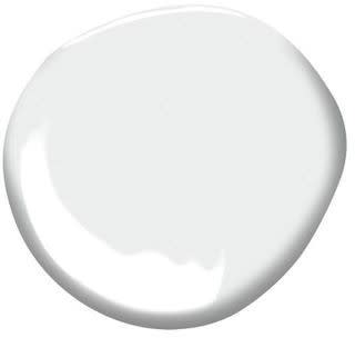
5) SIMPLY WHITE, BENJAMIN MOORE
"Benjamin Moore Simply White is always a crowd pleaser. It’s a warm, but true white, that looks both crisp and cozy in every space." -
Kristen Peña
“Benjamin Moore Simply White is my go-to for a kitchen. It just feels right–not too cool, not too warm.” -
Victoria Hagan
“Benjamin Moore Natura Simply White has a slight warm undertone, which keeps it from feeling too sterile (no hospital vibes here). I have yet to come across a color scheme Simply White wouldn’t complement. It also really goes to work in those darker spaces with little to no natural light because the paint color itself simply radiates. Bonus, this is an eco- friendly zero VOC paint for the environmentally conscious!" -
Meridith Baer
6) CHANTILLY LACE, BENJAMIN MOORE
"When I want a really clean, pure white like I used in every room of a Spanish Modern home in Los Angeles, my favorite shade is Benjamin Moore 'Chantilly Lace' OC-65. It has a subtle cool grey base as opposed to warm yellow undertones, which makes for a very clear and beautiful shade of white." -
Rosa Beltran
“The most universal paint color I've used is Chantilly Lace by Benjamin Moore. I find myself going back to it again and again in order to create a bright white space that is warm and welcoming rather than sterile and cold. In a sea of whites, this is my tried and true!”
- Nicole Davis
"It feels clean and bright without being cold or ‘dormy’." -
Melanie Burnstin
7) CHALK WHITE, BENJAMIN MOORE
"My favorite white paint color is Benjamin Moore 2126-70. It is appropriately named Chalk White–a grey-scale white, which works universally juxtaposed with cool and warm tones. I use this color for paint, stain finishes, custom color reverse painted glass and metal as a foil contrasting with other elements. Almost every paint schedule our firm issues includes this shade of white.” -
Katherine Newman
8) SNOW LEOPARD, PORTOLA
"My favorite choice for white is Snow Leopard by Portola. I am always in search of a white color with depth, but without other discernible tints.
This color creates a beautiful backdrop for both modern and traditional projects. Best of all, it is truly white when it’s up but creates a beautiful, warm environment."-
Kazuko Hoshino
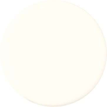
9) NAVAJO WHITE, BENJAMIN MOORE
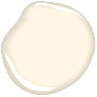
“Think melted vanilla ice cream. Its cream undertone makes it the perfect white for a country house and warm, naturally lit spaces. You can do a whole room in Navajo White and it stands alone and gives it a soul.” -
Alexandra Champalimaud
10) BANCROFT WHITE, BENJAMIN MOORE
“Why: Consistent, transitional across many styles and clean. We love its ability to translate to base moldings, door trims, doors and ceilings so seamlessly no matter the aesthetic—modern, rustic or traditional. It just works.” -
Becky Shea
